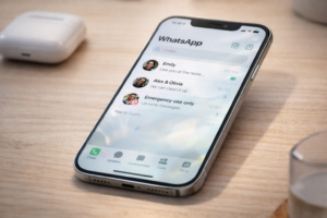
When WhatsApp updates its design, most people expect a fresh coat of paint. This time, the change goes deeper than that, even if it looks subtle at first glance.
The company is gradually rolling out a new interface on iPhones built around Apple’s iOS 26 design language, known as Liquid Glass. The update introduces translucent layers, floating elements, and smoother motion across the app.
But the real story is not just how it looks. It is how it changes the way the app feels during everyday use.
What Has Actually Changed Inside WhatsApp
The most visible shift is the tab bar at the bottom of the screen. It no longer feels fixed. Instead, it appears to float slightly above the interface with a semi-transparent finish.
This is not just a visual trick. The design allows background content to subtly show through, creating depth that reacts to what is on your screen.
Buttons and menus follow the same approach. They now use a frosted, glass-like appearance with smoother animations when tapped. Even the keyboard has been redesigned to look softer and more integrated into the overall interface.
All of this aligns with Apple’s broader shift away from flat design toward layered, dynamic interfaces introduced in iOS 26.
What has not changed is equally important. Messaging, calls, media sharing, and all core features remain the same.
Why This Update Feels Different After a Few Minutes
Most articles stop at describing the visuals. The more interesting change is behavioral.
After using the new interface for a while, the app starts to feel lighter. Not faster in a technical sense, but less rigid. Conversations appear layered instead of boxed in. Navigation feels less mechanical.
This matters because WhatsApp is not an app you visit occasionally. It is something people open dozens of times a day. Small visual friction adds up over time.
By softening edges, reducing contrast between layers, and introducing motion, WhatsApp is quietly trying to reduce that friction without forcing users to relearn anything.
The Part Nobody Is Talking About: Readability Tradeoffs
There is a downside to this design direction, and it is worth addressing honestly.
Apple’s Liquid Glass style has already received mixed reactions from users, with some reporting issues around readability and visual clarity in highly transparent interfaces.
That context matters here.
On WhatsApp:
- Light wallpapers can make text look cleaner
- Dark or busy backgrounds may reduce contrast slightly
- The glass effect can feel more “aesthetic” than “practical” in some situations
This is likely one reason the rollout is gradual. WhatsApp needs to ensure the design works across different devices, lighting conditions, and user preferences.
Read More: Can WhatsApp Messages Be Recovered After Deleting Your Account?
Why the Rollout Is Slow and Why That Is a Good Sign
The update is not available to everyone yet, even if you are on the latest version.
That is not a delay. It is a strategy.
Design changes are harder to fix than feature bugs. If a button does not work, it can be patched quickly. If the entire interface feels wrong, users notice instantly.
By rolling it out in phases, WhatsApp can:
- Monitor performance across older iPhones
- Study how users interact with the new visuals
- Adjust transparency and animations if needed
In other words, the slow rollout suggests this is a high-impact change internally.
How to Know If You Already Have It
There is no toggle or setting to enable the new interface.
The easiest way to check is the tab bar:
- If it looks flat and fixed, you are on the old design
- If it looks slightly raised and translucent, you have the update
Updating the app from the App Store and running iOS 26 is required, but not sufficient. Availability is still account-based.
A Practical Tip Most Users Will Miss
If you do get the update and something feels “off,” try this:
- Switch to a simpler wallpaper
- Increase contrast in iPhone accessibility settings
- Avoid overly dark backgrounds
These small changes can significantly improve readability with glass-style interfaces.
This is not officially required, but it makes a noticeable difference in real-world use.
What Comes Next
The current update is not the final version of this design shift.
Some parts of WhatsApp already use the Liquid Glass style, while others are still being updated. Future changes are expected to extend the same visual language to more elements, such as the voice note player and interactive components.
This suggests WhatsApp is moving toward a fully unified interface rather than a one-time redesign.
The Bigger Picture: Why This Update Matters
This update is less about aesthetics and more about alignment.
Apple is pushing a unified design system across all its platforms.
Apps that adopt it early will feel more native. Apps that do not may start to feel outdated.
WhatsApp’s choice to follow this direction signals something important. It is no longer just optimizing for functionality. It is optimizing for ecosystem fit.
Final Take
WhatsApp’s Liquid Glass redesign is not a dramatic overhaul. You will not open the app and feel lost.
But over time, it changes how the app feels in small, cumulative ways. It softens interactions, adds depth, and makes the interface blend more naturally with the iPhone experience.
Just do not mistake subtle for insignificant. This is the kind of update that quietly reshapes daily usage without announcing itself loudly.
And that is exactly why it matters.
Also Read: WhatsApp Without Phone Numbers: Is Your Privacy Really Safe?